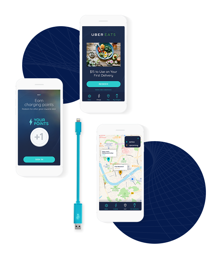
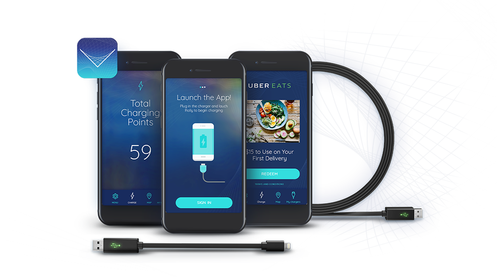
Consistent Visual Communication
This project belongs to a group of apps provided by Rally which works with rally charger.
Our main goal was to make visual communication very clear and consistent, even between the apps from the group. During the redesign process, to emphasize that all those apps belong to one brand, we created style guidelines, that can be also applied in the next apps. We share essentials elements between apps, starting with icons, buttons and form looks, typography and other basic elements. By using familiar patterns we allow users to learn faster how to use the app.
For Rally charge app we have used dark background colors and light texts. The main color is vivid turquoise, which makes CTA elements standing out from the layout. We stay with a minimalist, clear design based on delicate lettering and lined up icons.